by Laurence | May 31, 2007 | Being a startup, Local search, Loladex
A fashionable critique of many startups right now is: “Isn’t what you’re planning really just a feature?”
This is a polite way for people to say that you’re doomed.
The logic is that, ultimately, your functionality will be emulated by, and subsumed into, a larger offering — usually a search portal, although these days Facebook and MySpace also get mentioned a lot.
Since users are creatures of habit, this critique goes, they’ll want to get your functionality from a site they already use, rather than learning how to use a new site.
Besides, isn’t a search (or social) portal a better place to execute on your idea, since it can integrate users’ existing information & preferences?
This critique is most often made by money men, and generally means that they believe you’re too risky because …
- Your standalone business model (if you have one) can be blown away at any time by Google, or whomever; and/or
- You’re counting on an acquisition that can’t be planned for.
Of course, in a world where Google is trying to do everything, it’s practically impossible not to be accused — and with some validity — of building a feature rather than a product.
But the same was true of PC applications and utilities, not to mention browsers, in the age of Microsoft, and that didn’t mean it was dumb to start a business back then.
(Hmmm. Or maybe it did?)
Meanwhile, Google itself started with a product that was arguably “just a feature” of a larger site: For years, Web search was outsourced as such by Yahoo.
And long before that, IBM believed that Microsoft’s operating system was just a feature of the personal computer.
So how seriously should I take this critique, which I’m sure will be applied to Loladex? Because I’m certainly not counting on being Google or Microsoft.
Well, local search is already a “feature” of all the major search portals; almost by definition, then, a specific element of local search (the social aspect) is even more so.
And those portals have an entrenched position that’d give pause to any rational person.
On the other hand, the true power and meaning of certain “features” becomes evident only when they are placed front and center.
MySpace and Facebook are a good example: They took what could legitimately be seen as a “just a feature” of AIM (or AOL or Yahoo) — the user profile page — and, by reimagining it as a social hub, popularized a new paradigm.
The same thing could have happened at AIM, and maybe should have, but didn’t. Why? Because to AIM it was just a feature.
Same story, albeit on a smaller scale, with Flickr, which is about to replace Yahoo Photos, a service for which Flickr’s sharing aspects might once have been “just a feature.”
I suppose it’s fair to say that Loladex’s core functionality (which I don’t yet want to describe in detail) is a feature of Yahoo Local, or of Google Maps, or even of Yelp.
For sure, it already exists in some form on all those sites.
Where I differ from these sites, however, is that I don’t think it’s “just” a feature. I think it’s the most important feature — and that its potential will be realized only when it’s treated as such.
This, I believe, is a legitimate reply to the “just a feature” critique.*
Simply having a head-start against, or better execution than, a search portal — or, God forbid, imagining you’ll be acquired by one — isn’t a reasonable plan.
But if you claim that your functionality should be central to the competing sites for whom it’s now, or could be in the future, “just a feature,” then you’re staking out a defensible position.
If you’re right (still a gamble!) your competition will have to change something fundamental in order to compete, which is hard for a bigger company to do.
*Another legitimate defense, by the way, is to take the long view:The Web is becoming atomized and — led by MySpace — portals are morphing into places where users assemble a personalized set of features that they’ve gathered from around the Web.
As widgets and feeds become mainstream, focusing on a specific feature is a valid long-term plan as long as there’s a business model behind it.
In this new world, the smart portals won’t bother competing with specific features. Things will be much more symbiotic: Portals will vie to provide the best platform for integrating third-party features, the best tools for communication, and the largest collection of your buddies.
If you can leverage this emerging infrastructure, then building “just a feature” will no longer be a bad thing.
by Laurence | May 25, 2007 | Competitors, Local search
Before I start: Why am I even reviewing competitors of Loladex?
Because I need to gauge their strength; writing is how I think, and a review helps focus my mind.
Also, I believe that the local/social movement is, to paraphrase Ah-nuld, a learning computer. I toss my praise & criticism into the mix with an expectation that it’ll help raise quality across the category.
(In other words, I’m not doing this just to slam competitors — honest.)
So anyway, MojoPages is another “Local 2.0” rate-and-review site that has launched lately with the de rigeur beta label and a stated goal of being “the evolution of the Yellow Pages.” It doesn’t seem to have gotten any traction so far, but the Great Mentioner insists it’s a contender.
MojoPages certainly is an ambitious site. It launched with a whole mess of social-networking features: Friends, lists, groups, questions, small talk (suggested topic: “How is your day going?”), an e-mail system, and more. Its raw functionality builds on, and I guess trumps, the standard suite established by sites like Yelp.
Its general approach is post-Yelpy, too, with plenty of attaboys and “First to Review” labels.
MojoPages tries to distinguish itself, however, with a focus on video and a more structured & granular take on reviews: Rather than giving a business a single rating, for instance, you give it a Zagat-like three ratings — for value, service and quality. And rather than a single text blob, you can fill out CitySearch-like “pros” and “cons” sections.
 There are some things to like about MojoPages.
First off, the logo icon is clever and communicates the value proposition: The classic Yellow Pages icon, except with a thumbs-up instead of walking fingers. I like it.
And the focus on video, while it hasn’t been rewarded with much non-staff participation, could be worthwhile if they can get users to play along.
[Aside: I think they’re wrong to ask for “video reviews.” Postable video reviews are too much work to produce, duplicative of the written reviews, and generally low quality. Meanwhile, a simple pan around a restaurant with minimal (or no) narration, using a camera phone, can be immensely useful — as demonstrated on some of the MojoPages reviews.This is how I think user-generated video will flourish in local: As supplemental material, like photos, rather than as an alternative to text reviews. Some users will do complete video reviews, as several MojoPages staffers attempt, and companies like TurnHere will distribute professional video, but they’ll be a minority.]
Meanwhile, the business listings on MojoPages have some nice features, such as a business-specific link to the Better Business Bureau.
Alas, in almost every case the BBB link produces no result because there’s no matching BBB report. They should write a little spider that helps them remove all but the productive links, or see if the BBB will give them a feed.
Beyond these positives, I found the site to be cluttered with redundant features. The profusion of social tools is serious overkill, and unfortunately emphasizes how little participation they’re getting. (Class? Anyone? Anyone?)
I’m not sure whether transparency is a good idea at startup, but the site allows us see how many people have joined lately (anywhere from 0 to 10 daily) and guess at how many have joined in total (hundreds but not thousands). They’re probably not helped by an architecture that seems unfriendly to search engines.
Launching with a site that seems deserted is an occupational hazard of Web 2.0, but MojoPages has been up for a few months now and doesn’t seem to be building steam.
The result is a “Small Talk” section that shows only one post in the last month — and that from a staffer. The feature is one of several that MojoPages should simply shut down, if only to clarify where they want users to start.
MojoPages also has the typical range of beta issues, from misspellings to confusing navigation. Mainly, though, it’s trying to be too many things at the same time: Yelp and Facebook and YouTube, all in a muddle.
It’s early days, and I’m sure MojoPages will sharpen its focus. Its founders, whom I don’t know, seem to be enthusiastic. But for now, the overall effect is to make me appreciate what Yelp has achieved.
by Laurence | May 17, 2007 | Local search, Loladex, Social search
The folks at Local Matters in Denver, led by Perry Evans, just launched a beta version of their new site, LocalGuides.com. It’s an interesting take on “local social,” based on many of the same observations that are inspiring Loladex.
I’ll write more about this site after I’ve had a chance to dig into it, but my first impression is that (a) they are absolutely going in the right direction; and (b) there are a few blind alleys along the way. Oh, and (c) parts of it are too heavily monetized in a phone-booky way.
I was very nervous to look at LocalGuides.com last night, because Perry is a smart guy and I knew he’d be in the same ballpark as Loladex — except earlier by half a year. I’m not quite as nervous now; they’ve taken a somewhat different approach.
by Laurence | Apr 17, 2007 | Local search, Social search
Lately there’s been some attention focused on the pros and cons of rate-and-review sites such as Yelp, which is making headway in restaurant reviews, and TripAdvisor, which long ago reached critical mass in hotel reviews.
(Sample coverage: Search Engine Land, Greg Sterling, the New York Times.)
I find user ratings and reviews to be helpful, but they’re never as helpful as I’d like. Some of my beefs:
- Ratings and reviews require way too much work to analyze.
- Review coverage is almost always spotty. (TripAdvisor is an exception; it has extraordinary coverage.)
- Reviews seldom speak to my personal concerns.
I’m happiest when I don’t need to read any reviews at all: If one pizza place has 893 reviews with an average rating of 4.8 stars out of 5, for instance, and another has 514 reviews with an average rating of just 1.1 stars — well, I know where I’m going.
More often, however, one place has 7 reviews with an average rating of 3.1 stars, while another has 4 reviews with an average rating of 3.4 stars. Then I know that I’m doomed to a lot of reading, and that I won’t necessarily emerge with a conclusion.
Also, I rarely have any familiarity with the reviewers on (say) Yelp, even if they’re reviewing restaurants in my hometown. Do they have kids, for instance? Sure, I can hope they mention it in their reviews, or I can look at people’s profiles to see if they are somehow “like me.”
But really, do I have to work so hard?
I think my issues are pretty common. IMO they’re indicative of a larger disconnect: Despite their portrayal as such, rate-and-review sites just aren’t good tools for answering a question like “Where should I go for pizza in Leesburg?”
Rate-and-review is more of a due-diligence tool, better suited to answer a question like “What’s the scoop on Fireworks Pizza?” (Alas, no link to Yelp here; it has no reviews yet.) Such questions don’t necessarily feed into a recommendation. Indeed, they’ll often follow one.
This is the difference, I think, between social search and social research.
Of course, for some decisions — an anniversary dinner, a trip to Puerto Rico — I’m perfectly willing to spend time on due diligence, just as I’ll go to CNET when I’m researching a printer.
But mostly I just want a quick, trustworthy recommendation. And for that, I need a different type of tool. It could be editorial, a professional voice I trust and is, as luck would have it, omnipresent and omniscient.
Or it could be social, a quick way to tap into personally relevant opinions and information.
by Laurence | Apr 16, 2007 | Competitors, Local search
Now don’t get me wrong: Maps are an important element of local search. What’s more, Google Maps was a force for good when it launched, and possibly still is.
But when it merged its mapping and local products, Google cemented a meme that’s been pushing local search into too narrow a channel, both for Google itself and for the competitors it influences.
The meme, in short: Local = map.
Or worse, local = big honking map.
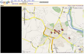
Here’s a (shrunken) screengrab from Google Maps for my classic sample query, [ Pizza ] near [ Leesburg, VA ]:
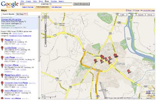
Presumably Google thinks the map is the most important thing on this page. On my screen it takes up ~75% of the space, and it expands along with my browser window.
By contrast, the results column on the left — the actual most important thing on the page — is constrained to 300 pixels. Even if I make my window bigger, it won’t get any larger.
Now compare the information that’s available from each of these two elements — the immediate payoff. The results column is information-rich, and is meaningful as a standalone element. That’s a high payoff. But the map is meaningless without either (a) looking at the left column; or (b) clicking on one of the stick pins.
Furthermore, the map can’t simultaneously display all of the information that’s being shown in the results column. I’d need to click the map ten times to expose it all — if the stick pins were all clickable, that is, and not stacked on top of each other.
And of course, a map might not even be relevant to my results. When I search for “pizza,” I may be interested in the exact location of each matching business. But when I search for “plumber,” or even “pizza delivery,” I’m probably not — what matters is service area, which is only roughly related.
In other words, Google’s map may seem like a strong visual summary, because that’s how we usually think of maps, but it’s actually very ineffective. It looks nice, to be sure, but it’s a terrible waste of space.
Black it out, and what have you lost?
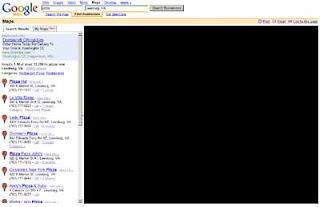 Very little, I’d argue. The same can’t be said about the results column:
 This doesn’t mean there shouldn’t be a map on the page, of course. I don’t even object to the size of the map, per se. The problem is that Google has left only 300 pixels in which to do everything else — which, as a practical matter, means it can’t do much.
Take Google’s new “My Maps” functionality, which launched the other day. It’s kinda interesting and philosophically in sync with Loladex. But of necessity it’s hidden behind a tab in the left column, where I can’t imagine it’ll have a chance to flourish.
That’s a real shame (except maybe for Loladex).
Indeed, Google can’t fit much except names and addresses in 300 pixels, which seriously limits the evolution of its product.
It can innovate within the map, I suppose, but IMO a map simply isn’t a good vehicle for displaying a result set in which the content of individual results is neither uniform nor already known by the user.
Supplementing or illustrating such a result set, yes — but not displaying it.
Not all of Google’s competitors are quite so constrained by their own maps, but it’s just a matter of degree. Google has framed the debate, as it so often does, and now any product without a huge map on the results page seems somehow … suspect.
Needless to say, Loladex won’t have a results page that’s overwhelmed by a map. Maps will enrich our site, but they won’t determine its shape.
by Laurence | Apr 13, 2007 | Local search, Social search
Here are some “typical” local searches — queries that people might type into an online Yellow Pages product or its equivalent:
- [ Pizza ] near [ Leesburg, VA ]
- [ Appliance repair ] near [ Grand Rapids, MI ]
- [ Lawnmower sales ] near [ Portland, OR ]
These queries are “search-engine speak”; people have been trained to formulate their desires in a particular shorthand, to maximize the chances of finding what they seek.
But do these formulations truly reflect what we’re looking for?
Nope: Unless someone is seeking information on a specific business, their query usually has an unspoken qualifier. For instance, I don’t just want pizza in Leesburg, VA — I want the best pizza in Leesburg, VA.
(“Best” is a frequent unspoken qualifier, but by no means the only one. Other likely suspects include cheap, trustworthy, prompt, authorized, etc. In an ideal world, I would add “used by my friends,” “owned by a neighbor,” and more.)
In order to become an important resource in people’s lives, a local search product must tackle these unspoken qualifiers — must make them central to its mission, in fact.
Without focusing on the unspoken qualifiers, which are mainly social-type information, the best a local search product can hope to be is “a better Yellow Pages.” And that’s not much of a rallying cry, IMO: Maps, attributes, blah, blah, blah.
This isn’t an original insight, I know. It was behind the recent burst of “Local 2.0” rate-and-review products — sites such as Insider Pages, Yelp and Judy’s Book — and, before them, the more scalable aspects of what I’d call Local 1.0: Places like CitySearch and my alma mater, AOL’s Digital City.
Still, the insight has yet to be fully acted on:
- Rate-and-review looks (to me, anyways) to be reaching the limits of its usefulness. It’s not the solution — or at least, not the whole solution. I’ll post more about rate-and-review soon.
- The search portals seem very ambivalent about pushing the social aspects of local search. They are heavily constrained by their devotion to a map-based interface, which won’t allow them put social information front-and-center.
Loladex intends to fill the gap.
