by Laurence | Aug 31, 2007 | Competitors
 Grayboxx is a new local search site that shares many of Loladex’s goals, but goes about things in a different way.
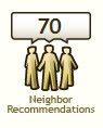
Specifically — as I understand it, anyway — they scour a bunch of sources, both online and offline, for “neighbor recommendations” of local businesses.
Many of these recommendations are implicit, as opposed to, say, the explicit endorsement of a favorable review on Yelp. The example Grayboxx cites is a repeat reservation at a restaurant: It’s a sign someone likes the place.
Grayboxx gathers a zillion such data points from sources it doesn’t disclose, runs them through a secret algorithm, and comes up with recommendations that extend even to obscure service providers in small towns — far wider and deeper coverage, in other words, than any competitor.
The company, which has been brewing for several years now, has large ambitions. It’s positioning its “PreferenceScoring” algorithm as the local equivalent of PageRank, the secret sauce that propelled Google into the stratosphere. And it has lined up a credible advisory board.
The site launched last week, sort of: It kicked off a national “tour” of the smaller towns where its coverage supposedly excels, starting with Burlington, VT. Since I don’t live in Burlington, I can’t judge what it’s doing there. Indeed, I’m not even sure what it means to be “on tour.”
However, the company also has a (non-public?) beta site that’s not limited to certain ZIPs. It’s very interesting. Grayboxx’s future shouldn’t be judged by it, I guess, but a few things are immediately clear:
- It looks nice. Simple, clean.
- It definitely has a lot of “neighbor recommendations,” even in small towns like mine, as promised.
- It doesn’t demand much of its users, which is good.
- It doesn’t tell users how it makes the sausage.
This last point, I think, may be crucial. Grayboxx is creating a mystique around its “patent-pending” methodology that may come back to bite it. Its claimed value — Find what your neighbors think — is a lofty one, but vulnerable to skeptics.
Grayboxx may be the site’s name, but the beta behaves more like a black box. It doesn’t explain the nature of its “neighbor recommendations” for any listing, nor does it provide much extra information or link to many user reviews. We’re left with the raw rankings.
The thing about black boxes, of course, is that they must work. Judgment is swift, and you don’t get to explain away bad results. Google aced this test in its early days, which is why it’s on top today. I’m not sure whether Grayboxx can follow.
Certainly I wasn’t bowled over by the results on the beta site. The algorithm doesn’t seem to capture character or local flavor, leaning toward bland businesses and chains. And some results were just weird.
As an example, I believe most of my neighbors here in Leesburg, Va., would recommend Lightfoot and Tuscarora Mill as two of the top five restaurants in town. I’d rank Tuskie’s first myself.
Grayboxx “ranked” them at #103 and #104 today, behind the hot-dog place in the food court (#38), Domino’s (#42, #89, #93), Subway (#46), Starbucks (#61, #74), a grocery store (#77), Taco Bell (#82), and many more, inluding several places that are closed.
Luckily for Tuskie’s — which has gotten heavy praise in Wine Spectator, Washingtonian and elsewhere — it still ranks as a better option than Ashburn Eye Care.
By one place.
Meanwhile the top-ranked restaurant near Leesburg, according to Grayboxx, is the Rail Stop in nearby Ashburn. I had never heard of it, so I looked it up. It’s a good restaurant but it’s actually in The Plains, a town almost 40 miles from Ashburn.
True, I can force Lightfoot and Tuskies to the top of the results with two rather non-obvious clicks. Grayboxx seems to have the ingredients for a good ranking system, but is outsmarting itself.
Who knows whether such observations are fair? None of the towns I tested have truly launched, so it’s too early to say. Still, Peter Krasilovsky points at a review from a Burlington resident who had a similar reaction: Grayboxx results are too “obvious,” providing little insight beyond popularity.
Certainly the black box needs some tweaking during Grayboxx’s rollout period, and the data needs scrubbing. (Ashburn Eye Care?) I believe the idea itself is workable, although the blandness factor may never be stamped out entirely — and threatens to stop Grayboxx from being any more helpful than, say, the Yellow Pages.
The underlying issue, I think, is that “real world” word of mouth involves a particular person (me) getting advice from particular people (my friends). It’s not as easy as watching to see where most locals go, or we’d all end up at the food court.
I’m sure that Grayboxx can re-weight its sources, rejigger its algorithm, and come up with more characterful recommendations. But local is above all personal, which means that emulating a non-personalized measure such as PageRank isn’t the best approach, no matter how well it’s done.
As long as every Grayboxx user is getting the same recommendations, something important is being lost.
by Laurence | Aug 15, 2007 | Competitors
I know this’ll sound pissy, but —
A story in today’s Washington Post claims that “Yelp” is becoming a verb, at least among Yelp users. The comparison to Google isn’t made, but it lurks between the lines.
I just don’t buy it.
The article is great for Yelp’s PR folks, as such assertions tend to get believed and spread, and it might even be a little bit true, but I doubt it’s a meaningful trend — and the reporter certainly doesn’t present a shred of evidence.
Now, let it be said: I like Yelp. This isn’t a slam on it. Still, I’d like this particular “news” to die aborning.
Consider:
The reporter quotes only one Yelp user, plus analyst Greg Sterling (who blogged about the phone interview on Monday) and Jeremy Stoppelman, Yelp’s CEO.
None of them talks about using “Yelp” as a verb — and even if they all did, the assertion still wouldn’t be convincing.
The reporter does say (in his own voice) that the Yelp user “couldn’t wait to … Yelp about” something, and Greg’s comments indicate that this guy really did use the verb to the reporter.
But seriously: One guy? Who today was the reporter‘s only Yelp friend and the first source of praise for his first Yelp review — two days ago? (Maybe that interaction came after the interview, but still.)
The other evidence for “Yelping” is an unsupported claim that some undefined number of users also use the verb. The reporter himself is a Yelp newbie, so I’m not sure where this generalization comes from. Even if he knew a lot of Yelpers before joining, wouldn’t they now be listed as friends?
I sound petulant here. I realize that. I’m not sure why I care about this, to be honest.
Maybe it’s because the WashPost is being naive? It’s never written about Digg in this way, for instance, even though “Digg” is — I’d assert, admittedly without proof — a far more common Web 2.0 verb.
Yelp itself has been pushing “Yelp” as a verb for ages now, of course. It’s sort of cute when used on the site, I guess. And I’m sure that some users — among the Yelp Elite, at least — have carried it into their real lives.
But that’s a small slice of Yelp’s limited demographic, and hardly WashPost-worthy news.
The rest of the story, meanwhile, doesn’t say much. Yelp exists, as it has for years. It now has a DC “site,” but that happened months ago. No stats to say how the site is doing, or how Yelp is doing generally.
Also, Yelp is kinda social networky and kinda bloggy. And it’s spending money rather than making it.
In short, it’s a Web 2.0 site.
The only observation that I found worthwhile was that Yelp reviews are “less about the business and more about the reviewer.” This is true of the site as a whole: More than anywhere I know, it’s turned reviews into a platform for self-expression.
That would have been a worthy thought on which to hang a story. Certainly better than the verb thing.
In my pissy opinion.
by Laurence | Jul 16, 2007 | Competitors, Local search
I generally don’t read Wired magazine unless I’m flying, so I haven’t seen much of it lately. But yesterday, in Dulles airport on the way to California, I picked up the July issue & noted this cover line:
Google Maps and the Rise of the Hyperlocal Web
Turns out there were two loosely related stories inside: A sloppy kiss for Google Maps as a platform for the coming geoweb, and a “dispatch from the hyperlocal future” from cyberpunk author & pundit Bruce Sterling.
I agree that Google Maps — Google generally, really — is setting some of the terms of debate in local, and that KML, the emerging standard it acquired via its purchase of Keyhole, is a Good Thing.
Still, the story went a bit far in its “game over” portrayal of Google Maps as the epicenter of a movement that’s (according to me, anyway) far too young to have a leader, let alone a winner.
The story’s broader points were well taken, however, and the overall thesis — that people with tools, not companies with algorithms, will power this geostuff — captured something real. As always, I don’t like the facile equation of local=maps, but what can you do?
All of this dovetailed nicely with another July feature, a nice profile of Luis von Ahn — a MacArthur winner with a human-centric outlook on computing. The most interesting article in the issue, by far, and obviously applicable to local.
Bruce Sterling’s riff on hyperlocal, alas, was speculative quasifiction, and darn near unreadable. I’d like to see Wired tackle what “hyperlocal” actually means, but this was just a parade of buzzwords, mostly made up.
by Laurence | Jun 18, 2007 | Competitors, Local search, Loladex
Palore is a simple browser tool that recognizes when you’re using a local-search site and artfully annotates your results with little informational icons.
An annotated result on Google Maps looks like this (I’ve circled the Palore icons, which wouldn’t normally appear on Google Maps):
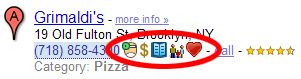 Mousing over an icon gives you a pop-up with more info. The little doctor icon, for instance, shows health-violation data. You might also see reviews, booking links, and more.
This is extremely useful: In essence, Palore is showing Google — and everyone else — how to address some of the weaknesses of a map-dominated interface. (My somewhat outdated post on Google’s UI is here.)
Palore is supposedly in closed beta, by the way, but you can download some specialized versions (kosher, Zagat, “green”) from its home page.
I read about Palore a while ago and thought it was a great idea — which is another way of saying that it’s kinda like Loladex. Apparently it has done very well in Israel, where it started.
When I finally got around to downloading it today, however, I found that the specialized versions don’t appear to include the most important feature: The ability to pick & choose which icons get displayed, and how they get displayed — to switch off everything except the health-violation icon, say, or to put the menu icon first.
Maybe this functionality is in the non-specialized version? Certainly it’s implied by Palore’s home-page text:
- “Use Palore to see the things you care about when looking for restaurants and other local businesses online”
- “Choose from dozens of information-icons that will instantly appear in any search site you use”
Yup: That’s what I want! So why can’t I do it?
Assuming the “real” beta works the way I’d like, or at least that it ultimately will, here are my nominations for what else could be better about Palore — which I really do admire, by the way:
- I’m sure Palore hears this from everyone: No one wants to download a browser add-on. It’s pretty painless, but it’s still a psychological hassle & it limits their potential audience. Airfare metasearcher Sidestep went this route for years until, in essence, it was forced to change its focus by fast-growing competitors such as Kayak. Sidestep still offers a plug-in, as well as a Google toolbar with integrated Sidestep functionality, but both options are buried in its destination Web site — as they should be. Palore is building its model on a behavior that its users will adopt only grudgingly.
- Very much related: Palore adds information to other sites’ search results, but it doesn’t allow me to adjust the results themselves. If Palore knows that I care about vegetarian restaurants, for instance, it knows that Google Maps’ #9 result is much more relevant than the #1 result. But as the user, I’ll still need to scroll down to realize this fact. Worse, the most relevant result may be on the third (or thirtieth) page of results.
- Both of the above complaints amount to the same thing, I guess: Palore would be better off building a destination site. The local-search space is still wide-open, and they should have the courage of their convictions. Maybe they figure they’ll get more traffic by piggybacking on established sites, but I bet they’re wrong.
- Palore doesn’t seem to be exposing an API that would allow anyone to power an icon without their mediation; instead, you’re asked to contact them about “partnering opportunities.” No matter how streamlined their process is, it’s more limiting than do-it-yourself. Not very 2.0.
- Palore seems overly focused on restaurants. (They address this in their blog.)
- A minor quibble: Palore doesn’t work on Yahoo Maps, because Yahoo Maps is built in Flash. That’s a big traffic source, and could really benefit from Palore icons. But of course I’ve already recommended that they move away from this model, so I can’t complain much. And I don’t think it’s addressable, anyway.
Having said all this, I must add that I hope Palore doesn’t read this post — or, if it does, that it doesn’t take my advice. If it did, I’d have a scary competitor.
by Laurence | May 25, 2007 | Competitors, Local search
Before I start: Why am I even reviewing competitors of Loladex?
Because I need to gauge their strength; writing is how I think, and a review helps focus my mind.
Also, I believe that the local/social movement is, to paraphrase Ah-nuld, a learning computer. I toss my praise & criticism into the mix with an expectation that it’ll help raise quality across the category.
(In other words, I’m not doing this just to slam competitors — honest.)
So anyway, MojoPages is another “Local 2.0” rate-and-review site that has launched lately with the de rigeur beta label and a stated goal of being “the evolution of the Yellow Pages.” It doesn’t seem to have gotten any traction so far, but the Great Mentioner insists it’s a contender.
MojoPages certainly is an ambitious site. It launched with a whole mess of social-networking features: Friends, lists, groups, questions, small talk (suggested topic: “How is your day going?”), an e-mail system, and more. Its raw functionality builds on, and I guess trumps, the standard suite established by sites like Yelp.
Its general approach is post-Yelpy, too, with plenty of attaboys and “First to Review” labels.
MojoPages tries to distinguish itself, however, with a focus on video and a more structured & granular take on reviews: Rather than giving a business a single rating, for instance, you give it a Zagat-like three ratings — for value, service and quality. And rather than a single text blob, you can fill out CitySearch-like “pros” and “cons” sections.
 There are some things to like about MojoPages.
First off, the logo icon is clever and communicates the value proposition: The classic Yellow Pages icon, except with a thumbs-up instead of walking fingers. I like it.
And the focus on video, while it hasn’t been rewarded with much non-staff participation, could be worthwhile if they can get users to play along.
[Aside: I think they’re wrong to ask for “video reviews.” Postable video reviews are too much work to produce, duplicative of the written reviews, and generally low quality. Meanwhile, a simple pan around a restaurant with minimal (or no) narration, using a camera phone, can be immensely useful — as demonstrated on some of the MojoPages reviews.This is how I think user-generated video will flourish in local: As supplemental material, like photos, rather than as an alternative to text reviews. Some users will do complete video reviews, as several MojoPages staffers attempt, and companies like TurnHere will distribute professional video, but they’ll be a minority.]
Meanwhile, the business listings on MojoPages have some nice features, such as a business-specific link to the Better Business Bureau.
Alas, in almost every case the BBB link produces no result because there’s no matching BBB report. They should write a little spider that helps them remove all but the productive links, or see if the BBB will give them a feed.
Beyond these positives, I found the site to be cluttered with redundant features. The profusion of social tools is serious overkill, and unfortunately emphasizes how little participation they’re getting. (Class? Anyone? Anyone?)
I’m not sure whether transparency is a good idea at startup, but the site allows us see how many people have joined lately (anywhere from 0 to 10 daily) and guess at how many have joined in total (hundreds but not thousands). They’re probably not helped by an architecture that seems unfriendly to search engines.
Launching with a site that seems deserted is an occupational hazard of Web 2.0, but MojoPages has been up for a few months now and doesn’t seem to be building steam.
The result is a “Small Talk” section that shows only one post in the last month — and that from a staffer. The feature is one of several that MojoPages should simply shut down, if only to clarify where they want users to start.
MojoPages also has the typical range of beta issues, from misspellings to confusing navigation. Mainly, though, it’s trying to be too many things at the same time: Yelp and Facebook and YouTube, all in a muddle.
It’s early days, and I’m sure MojoPages will sharpen its focus. Its founders, whom I don’t know, seem to be enthusiastic. But for now, the overall effect is to make me appreciate what Yelp has achieved.
by Laurence | Apr 26, 2007 | Competitors
While earlier Web 2.0-ish local sites have been dealing with shifting sands, new sites continue to appear. YellowBot is among the latter, and appears to be hanging its hat on tags.
What’s to like about YellowBot? Here are a few things:
- Tags are generally a good idea
- YellowBot has bought nationwide base data from Localeze, which means I don’t have to wait for users to build the site
- It has pre-seeded the tags
- Its location input box has a “suggest” feature that finds matching street addresses in real time, which I haven’t seen before
What’s not to like?
- The pre-seeded tags are a bit hinky, which makes them less useful. In fact, the site’s data seems shaky overall. More on this below.
- Despite the somewhat cool street-address feature, the location “suggestions” work rather weirdly. (Try typing in an address.)
- The site has virtually no user content, even in places where I’d imagine it should, such as its hometown of LA. It has imported some reviews from CitySearch, Zagat and possibly elsewhere, but this seems inconsistent.
- The editorial tone of the site is exclusionary, or possibly just dumb.
The tone is a problem because it’s grating and counterproductive. Maybe I’m getting too old, but I refuse on principle to rate anything as either “rank” (1 star) or “off the heezy” (5 stars):
 This tone is echoed in the FAQ:
Tags are the flava … of YellowBot.
Mmmm-hmmm.
Is it possible that some people think this is cool? I suppose so, but I can’t imagine YellowBot will get lots of reviews of lawyers and lawn-care services (both of which it touts on its home page today) from such an audience.
Other things will be harder to change. There’s the whole chicken/egg problem of sparse user content; I’ll post soon about that general issue.
And then there’s the data, especially as reflected by tags. I suspect that YellowBot bought its pre-seeded tag content, and the UI really plays it up. Some of it is useful, the rest … not so much.
As a minor example, my brother John runs a hot-dog joint on Hollywood Boulevard in LA. Skooby’s is famous for its hot dogs. YellowBot’s tags for the place, none of which appear to have been contributed by users, are as follows:
Bar Food – Burgers – dining – food – Pizza – restaurant
OK, I forgive the absence of “hot dogs.” But “burgers” and “pizza” are actively wrong. John serves burgers in his quasi-nearby Hermosa Beach location, but YellowBot doesn’t have that listing at all. He doesn’t serve pizza anywhere. If I search for “pizza” and get directed to Skooby’s, I’m being misled.
(I’ll find lasting consolation in LA’s best hot dog, fries and lemonade, of course.)
Some of the YellowBot tags appear to have been entered from Yellow Pages ads. Others are just a mystery. Here’s one medical place in Leesburg, VA:
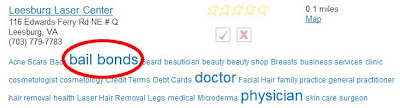
And another:

It’s not just tags. The number-two result for a search on “doctor” in Leesburg, VA, is listed as follows:
Jackson River Orthopedics PC
I-64 Exit 21
Leesburg, VA
This business isn’t in Leesburg. I-64 goes nowhere near here.
Unfortunately, I didn’t have to look very hard for examples like this. I’m hoping that YellowBot will work out these kinks before long.
